Rendering an options Greeks surface in 3D in the browser
A 3D render crossed my feed once, one of the slow rotating surfaces the account tuba.captures posts, the kind where you can almost feel the curvature through the screen. It stuck with me, and a few days later I wanted that for something I actually stare at: an option.
An option is a contract that lets you buy a stock at a set price later, and it is normally drawn as a hockey-stick: the payoff on the day it expires, a flat line of value against price. But that picture is only the last day. The days before it, the ones you actually hold through, are a curved sheet of profit and loss bending over price and time together, and the flat chart throws that second dimension on the floor. So I priced the option across a grid of prices and dates, stacked the profit and loss as height, and drew it as a surface I could grab and turn. It is live in the playground, at /play/greeks-manifold.
The first time I rotated it, gamma was just sitting there. The Greeks are the standard set of numbers traders use to describe how an option behaves. Gamma is the one for how sharply the option's value bends, and it is biggest right at the strike price (the price the option lets you buy at). As a number it is abstract. On the surface it is a ridge, a visible spine running across the sheet near the strike, and coloring the surface by gamma lights the ridge up. Theta is another Greek: the value the option loses as expiry nears. On the surface it is the downhill slope in the time direction, so you can see exactly where it bites hardest. The numbers I had been computing as columns in a table were just the shape of the object, seen from different directions.
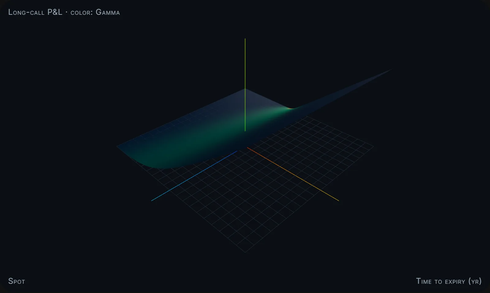 The surface from the playground, colored by gamma. The glow along the strike is the ridge; the hot spot is where the bend is sharpest.
That was the hook. If one piece of option math could become a shape, the rest could too.
Most of the finance vocabulary in this post is vocabulary I only really understood once I could see it. The definitions are what I learned building this.
The five at a glance#
| Surface | The three axes | What you are looking at | When to open it |
|---|---|---|---|
| Greeks manifold | stock price, time, profit/loss | an option's value bending, colored by a chosen Greek | before an options trade, to read the terrain ahead |
| Drawdown topology | time, account value, simulated path | a fan of simulated outcomes, colored by how far each is underwater | to calibrate your gut for how deep a bad run can dig |
| Yield curve dynamics | borrowing length, time, interest rate | the Treasury curve changing shape over time | to watch an inversion form (the recession warning) |
| Correlation regime | asset, asset, co-movement | the grid of how assets move together, tightening calm to crisis | when a sell-off starts and diversification evaporates |
| Implied-vol surface | strike, expiry, implied volatility | the volatility that option prices imply, as one sheet (the synthetic-smile mode of the Greeks manifold) | to read the volatility smile in a single glance |
The drawdown topology is a fan of thousands of simulated price paths. (Simulating a lot of random paths to see the range of outcomes is called Monte Carlo, after the casino.) Each path is colored by its drawdown, which is just how far it has fallen from its high point. Flip the simulated returns from an ordinary bell curve to a fat-tailed one, meaning big jumps happen more often, and the whole cone visibly bulges. The textbooks say tails matter; here you watch the hole get deeper.
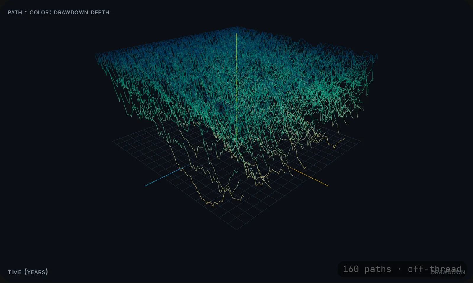 The fan, colored by drawdown depth. The yellow strands are the deep holes, the runs the bell curve says should barely happen.
The yield curve is just the interest rate for borrowing money over different lengths of time, from one month out to thirty years. Normally it slopes up, because longer loans cost more. Drawn as a surface you scrub through time, you can watch it invert, where short-term rates climb above long-term ones, the shape everyone calls a recession warning. Reading that an inversion happened lands as a statistic; watching the surface fold over lands somewhere lower.
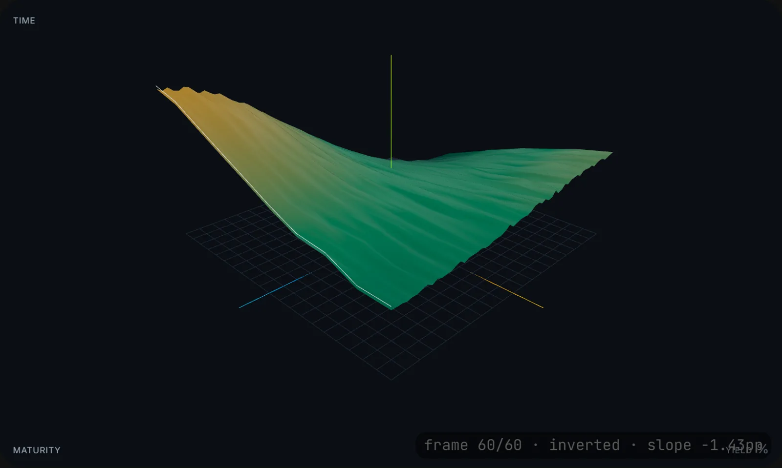 Scrubbed to the far end of the story: short rates above long, the fold everyone calls a recession warning.
The correlation regime is the one I find hardest to look away from. Correlation is how much two assets move together, and the grid shows it for every pair at once. You dial it from calm toward crisis. "In a crash, all correlations go to one" is a line everyone repeats; watching every cell in the grid climb to one at the same moment is diversification evaporating in front of you, exactly when you were counting on it.
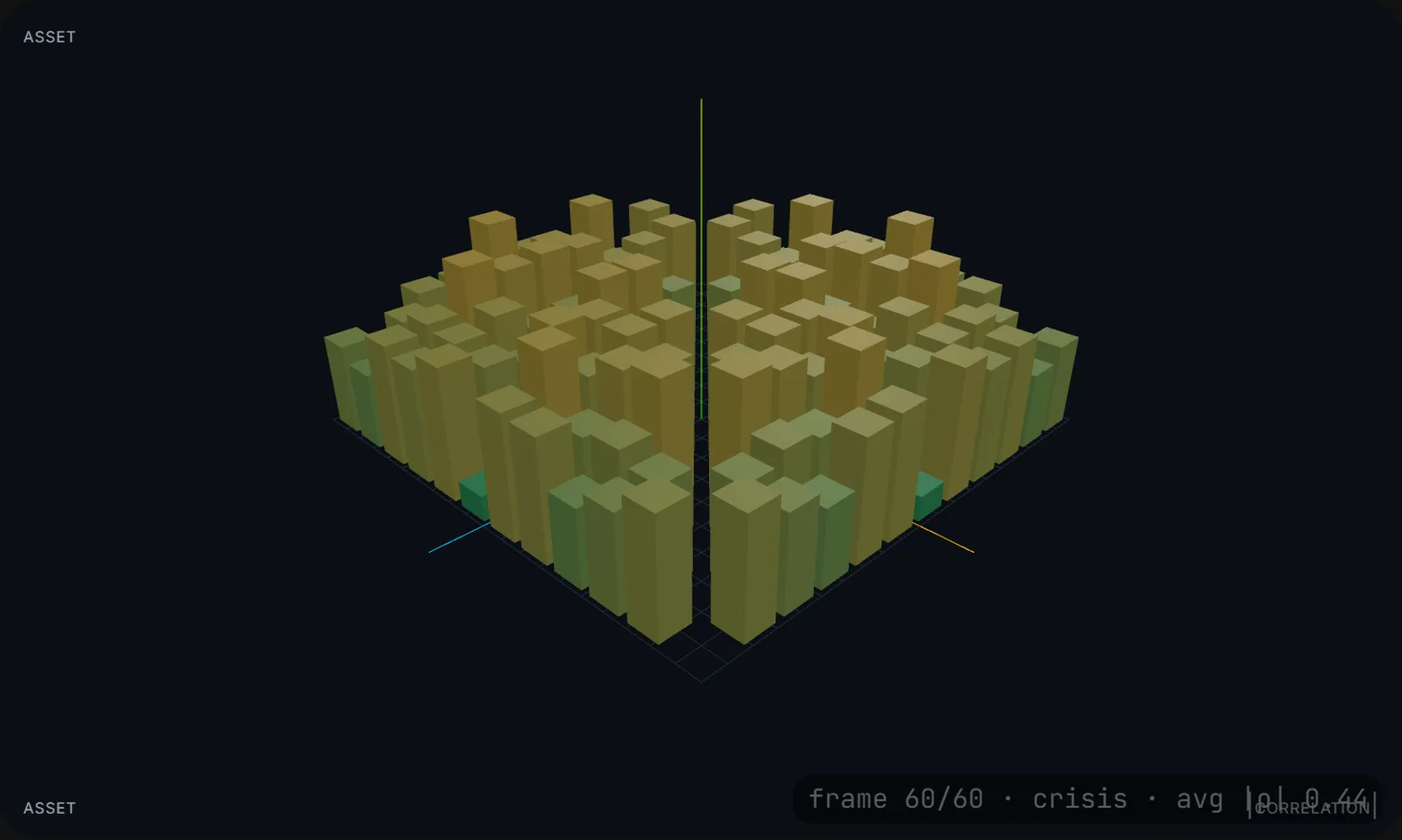 The grid at the crisis end of the slider. The whole field rising together is the moment diversification stops helping.
And the implied-volatility surface, the synthetic-smile mode of the Greeks manifold, plots implied volatility, which is how much the market expects a stock to move, read backward out of what its options cost. Plot it across every strike price and expiry date and it has a shape, the famous "smile," where the market charges more for some outcomes than others. A row of separate option quotes hides that; the surface makes it obvious. The math here leans on a small C++ options pricer I wrote, cross-checked against a reference implementation before I trusted a single number it produced.
One trick, five surfaces#
Most of the work in that first surface had nothing to do with options. The math is one plain function that takes some parameters and returns a grid of numbers; it has no idea it will ever be drawn. The drawing is a separate piece that takes a grid of numbers and turns it into a 3D mesh; it has no idea the numbers are options. Between them sits a plain data object.
Once that boundary existed, a new visualization was mostly a new math function bolted onto the same drawing code. The first surface was most of the work, the camera and the colors and the controls; every one after it was a new function feeding the same machinery, which is how one became five. And because the renderer is indifferent to where its numbers come from, I can test all of the math against exact textbook answers without ever starting up the graphics hardware.
The payoff I did not plan for was a compliance win. These pages are public, and the rule behind them is strict: a public page can show public market data or made-up illustration, and nothing from the private engine that actually picks stocks. Written down, that is a rule I have to remember in every review, the kind you eventually forget once. But the renderer cannot tell where its numbers came from, so the rule stopped being something I enforce and became something the structure enforces: the public page is handed a public data object, and there is simply no path in the code for anything proprietary to reach the screen. The boundary I built to keep the math testable turned out to make the one mistake I most feared impossible to make.
One smaller habit paid off out of proportion: four of the five animate from a slider you scrub rather than from an internal clock. That keeps the animation predictable and testable, and it means the slider is the single source of truth for what you are seeing, not a side effect of however fast your screen happens to be drawing.
Real data, not just textbook math#
I have a lot of market data sitting around, and that same split is why pointing these surfaces at it was a swap and not a rewrite. The yield curve can now show the actual recent Treasury curve from the Federal Reserve's public FRED data; the correlation grid can show how the real sector funds (technology, energy, financials, and the rest) have actually been moving together; the option surfaces can re-center on a real stock and tune themselves to how much it has actually been bouncing around. The list of stocks you can pick started as a curated handful and is now any name in the S&P 500. Loading all five hundred at once would weigh down every visit, so the page fetches one only when you choose it. The made-up version is still the default; the real one drops in behind the exact same renderer, which never knew the difference.
One last detail I had to get right: three.js, the library that does the actual 3D drawing, is heavy, and these pages are otherwise light and static. So none of that code ships inside the page. It loads only after you arrive, as a separate chunk, which is why the playground opens instantly even though every surface is a full graphics scene underneath.
Not a crystal ball#
Part of me wanted a crystal ball. I have a pile of market data and I keep trying to mold it into something that tells me what to do next, and somewhere in the back of my head I hoped that seeing it in three dimensions would make the move obvious. It does not. None of these predict anything. They take numbers I already have and let me look at them from a side I could not see before.
That turned out to be worth more than I expected. Reshaping the same data into a surface I can turn has taught me more about how portfolios and quant strategies actually behave than any forecast did, even the surfaces I am still learning to read.
So, not trading tools. Open one and turn it: start at the playground and grab the Greeks surface, or watch the correlation grid go to one.
Built on#
- three.js for the 3D, with react-three-fiber and drei (from the pmndrs collective) driving it from React.
- Material UI for the controls, Next.js for the app.
- Public data from the Federal Reserve's FRED, Financial Modeling Prep for prices, and Wikipedia's S&P 500 list.
- A small C++ options pricer I wrote for the volatility math, and the nudge from tuba.captures.
Related:
- Building an AI finance app, the engine whose public outputs some of these surfaces draw on
- Backtesting without fooling yourself, the rigor that has to sit behind any real-data mode